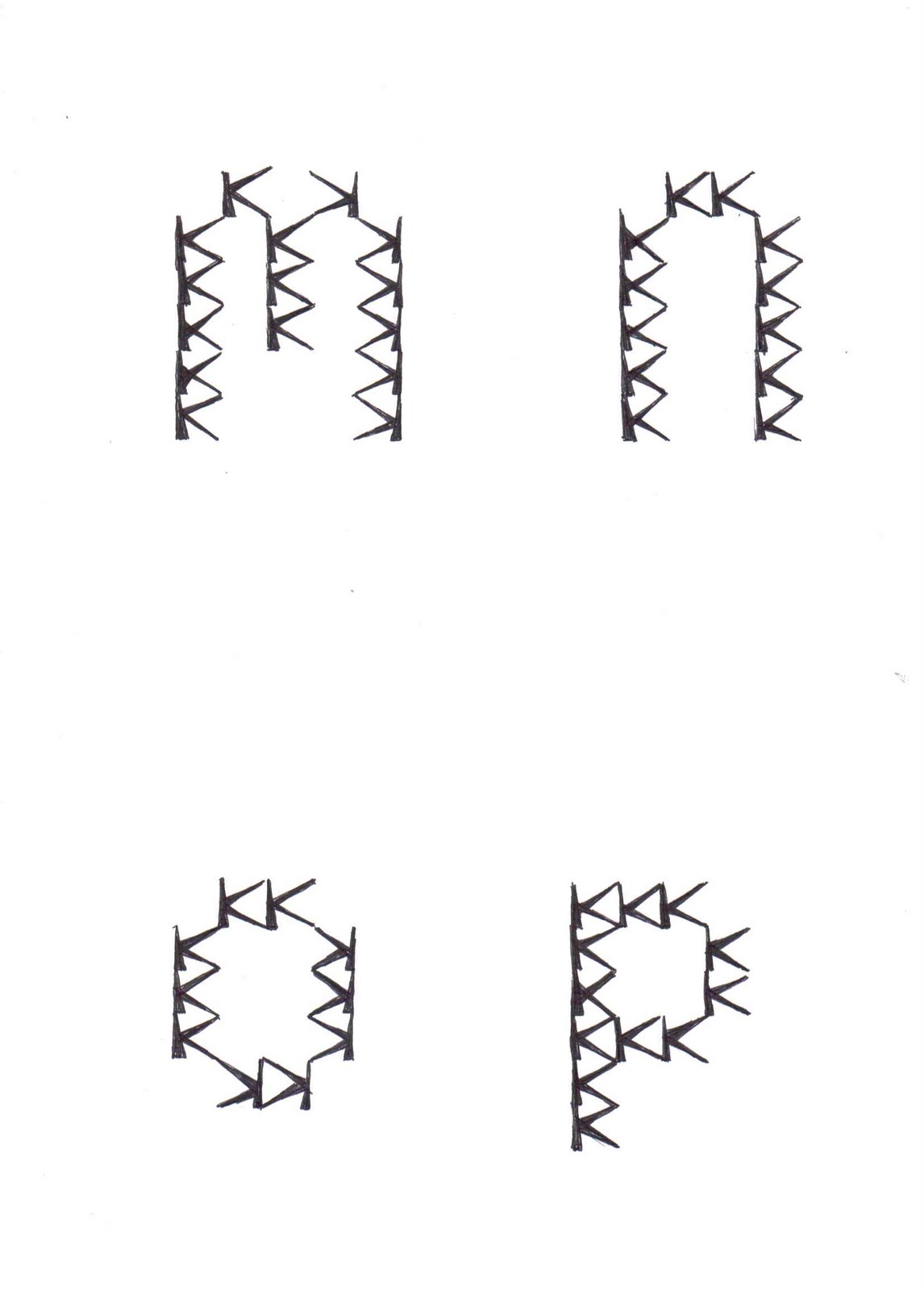
We recently where given a project to design our own geometric alphabet from the basic shapes, and by using a 10mm grid we organized the size and shape.
To plan I sketched out the alphabet in circles, triangles and a combination of the before mentioned. I then tried out using one letter that i had created in repetition to create all the letters. Through this, it was obvious that the letter K that had been drawn worked best because of the tessellation. This was what I came up with.
Showing posts with label typography. Show all posts
Saturday, 15 January 2011
Sunday, 17 October 2010
Craig Ward
Craig Ward uses type in a way that entwined nature and man made objects to give a representation of the alphabet, giving an end result of an image that is outstandingly beautiful.
This image was made using cuttings of hair from a hairdressers when Craig had gone to get his hair cut and saw what resembled the letter C on the floor. He then played around with these cuttings until the letters came to life. After these where put into Photofont to create the new type.
Ward's work has been influenced by many experimental artists such as Chuck Close, and later on, Karsten Schmidt. He felt that Chuck Close's work was relevant to his because he believed that the brain was capable of making huge cognitive leaps when it came to recognising forms like the face. And that, because of that, he felt comfortable and able to abstract it so greatly. The same was said for Craig's work by using letters that have been so deformed in shape but we can still read the meaning.
Saturday, 16 October 2010
Stefan Sagmeister- ART GRANDEUR NATURE 2004
For the series; list of 'things i have learned,' Sagmeister made several quotations into short slides which included different ways of representing the words. For this particular one, 'Art Grandeur Nature,' he used inspiration from his childhood. His Grandfather had been trained in the art of sign painting and many examples had been apart of the house Sagmeister grew up in.
I think what is most eye catching about this use of natural typography is the attention to detail and placements. Each word can be associated with its background, for example the 'To Look' image is placed over a picturesque view.
Subscribe to:
Posts (Atom)